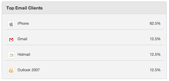
 This shouldn’t require much explanation. 62% of our email subscribers read email on mobile devices. You may find the statistics are similar for your email marketing.
We are mobile, email is mobile. Thus most email gets opened and read on mobile devices. It’s a fact!
However most email marketing is not mobile friendly.
Here are a few quick tips to make your email mobile friendly:
1. Use a two-column template and place your main content to the left. That’s all that will be visible on most smart phones, without requiring the user to move the content around. But with the second column in place you’ll be able to display additional content to those who will read your email on a computer.
2. Make the left hand column 320 pixels wide. The new iPhone 4 has a resolution of 640 but there are still plenty of other email mobile readers and users with smaller screen resolutions. As time passes and smart phones get higher resolution screens you may need to upgrade to 640, but for right now, stay with 320.
3. Send HTML emails not image emails. Most email readers, including mobile email readers, won’t automatically load images, and most smart phones won’t automatically resize images.
And this is not just a mobile issue. Spam filters look for image to text ratio, the larger the image to text ratio the higher the odds that your email will get marked as spam.
So, in this day and age, with how many templates and low-cost email solutions there are available, it’s unacceptable to still send image-only emails. So unless you want your email to look like this one, invest the time or money or both to get a nice html template set up.
4. Make clickable links and calls to action tappable. In other words, make them big enough for a finger to comfortably tap on them. Yes my friends, it’s a finger-tapping economy so adapt your emails to it.

Want to see what our emails look like? Sign up for the Lightspan Monthly Newsletter. We promise it’s worth it – we only send the best social media and email marketing tips.

Leave a Reply